Des Frühlings wegen / Because of spring

Collage 2013 – 34 x 24 cm
Des Frühlings wegen / Because of spring
Collage 2013 – 34 x 24 cm
One from the archive but it fits perfectly to the themes of the week
„Urban“ at Illustration Friday
and „Cities“ at Collage Obsession.

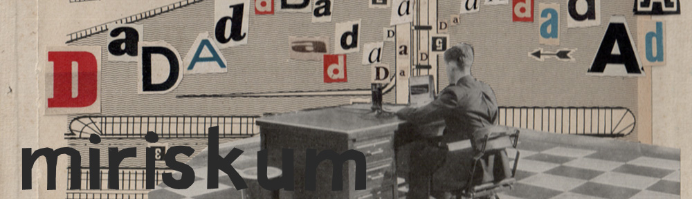
Collage 2012 – 18 x 25 cm
That fits to the theme of the week „Urban“ at Illustration Friday
and to the theme of the week „Cities“ at Collage Obsession.
Catch a glimpse in the portfolio „Up and down“ too – 14 extra pieces from my new series will be found there !

Collage 2013 – 21 x 29,7 cm

Collage 2013 – 27,6 x 23,3 cm
So – und damit soll´s jetzt mit dem Winter aber auch Schluß aus und vorbei sein!

Eine spezielle Methode, Rieseneier aufzuschlagen.
A special technique cracking giant eggs!
My second piece for The Kollage Kit and Illustration Friday.

“A ship in a harbour is safe, but that is not what ships are built for.” William Shedd

Collage 2013 – 22 x 27,7 cm
Der Abwechslung wegen – und auch, weil es für Illu-Friday ist!
I proudly present my new collage series „Up and Down“. I will post all of the pieces within the next days. If you’d like to win one hand-signed print of your favorite collage feel free to leave a comment. Among all comments posted I will draw one randomly.
And here we go!
Ein wenig stolzgeschwellt präsentiere ich meine neue Collage-Serie „Auf und ab“.
Ich werde alle Collagen in den nächsten Tagen posten. Unter allen dazu eingehenden Kommentaren werde ich am Ende einen losen. Der Gewinner/ die Gewinnerin erhält dann einen signierten Print aus der Serie von der Collage seiner/ ihrer Wahl.
Und los geht´s!

o.T. – 21 x 29,7 cm
Wie bestellt ist dann auch noch das Thema der Woche bei meinem Zweitblog „The Kollage Kit“: Extreme Sports!
I have reworked last week´s collage „Beauty and Beast“: Questioning if the blue background was important for the collage´s statement. Frankly speaking: I don´t think so. I like them much better on the black background – the picture is reduced to the core message and moreover freed of unnecessary frills.
What do you think? Opinions are very welcome.
Meine „Beauty and Beast“ Collage von letzter Woche habe ich noch einmal überarbeitet: Ich habe mich gefragt, ob der gestaltete blaue Hintergrund für die Bildaussage wirklich wichtig ist. Offengestanden habe ich nicht den Eindruck.
Auf Schwarz gefallen mir die Beiden sehr viel besser – das Bild ist auf die Kernaussage reduziert und von überflüssigem Schnickschnack befreit.
Was einst DU? Meinungen sind mir SEHR willkommen!


